Projects in Digital Humanities
Projects by Phil Reed at The University of Manchester
This project is maintained by PhilReedData
Digital Humanities Library Lab: Exploring digital collections, 24 May 2017
Activity: Colour analysis with front covers of publications
Objectives
Analyse a visual aspect of an entire historical collection using a simple tool and begin thinking of questions to ask. Repeat the process with another collection and a developed set of tools from another institution.
Overview
- A (relatively) simple example I developed, using Illustrated London News
- Tasks
- How was the tool built?
- A more developed example from Yale University Library, using Vogue
- More tasks
A (relatively) simple example I developed, using Illustrated London News
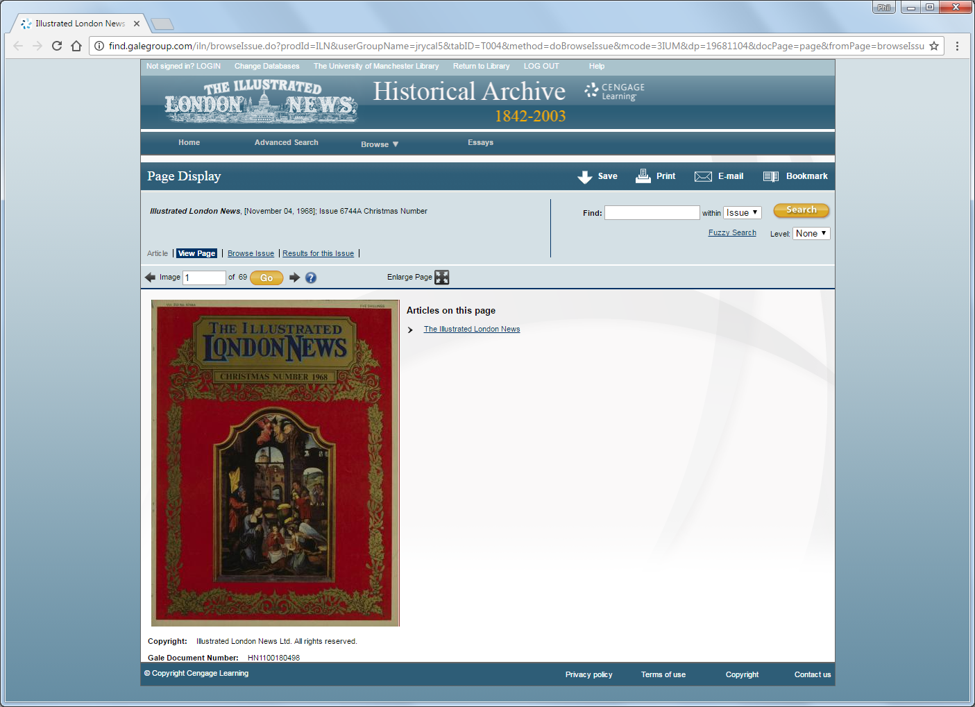
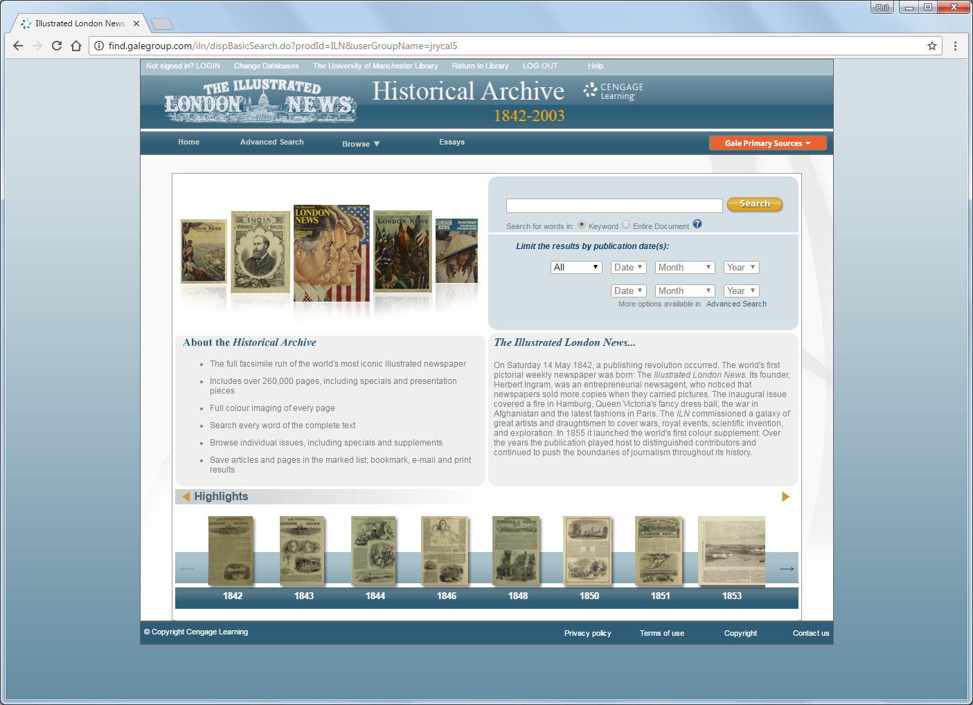 The University of Manchester subscribes to the Gale Cengage collection Illustrated London News Historical Archive 1842 to 2003. Access to Illustrated London News is provided online through usual browse and search tools within a web interface.
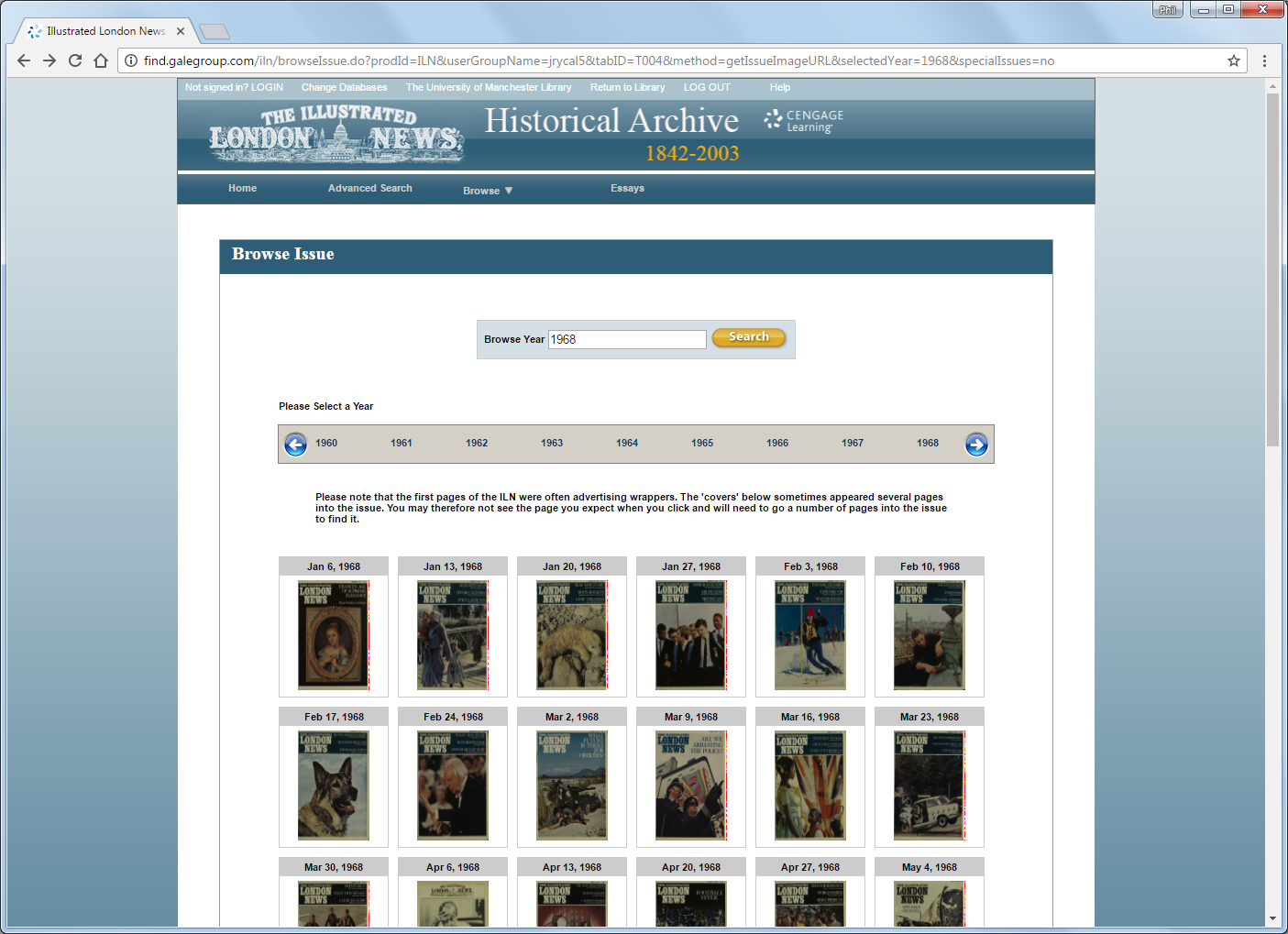 You can search for keywords or any text within the documents, or browse the issues’ front covers by year. This interface suits many uses but does not, for example, allow one to look at the covers of all issues at once.
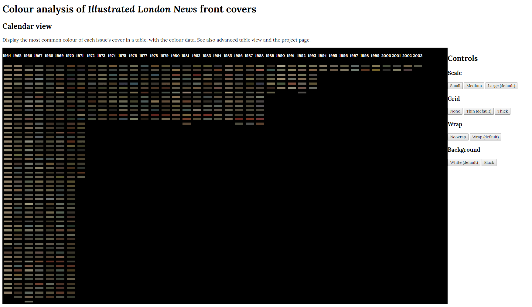
We have a back-up hard drive with all issues, as OCR-transcribed text files and image scans. I wrote a tool to quantify one aspect of the cover image, its (crude) average colour, and show this in a calendar view. It covers data from 1964 onwards, when colour was first used on the cover.
(Note that the crude method to determine single mode colour the image is used to keep the workshop simple. A better method would be to use k-means clustering for the k main colours of the image.)
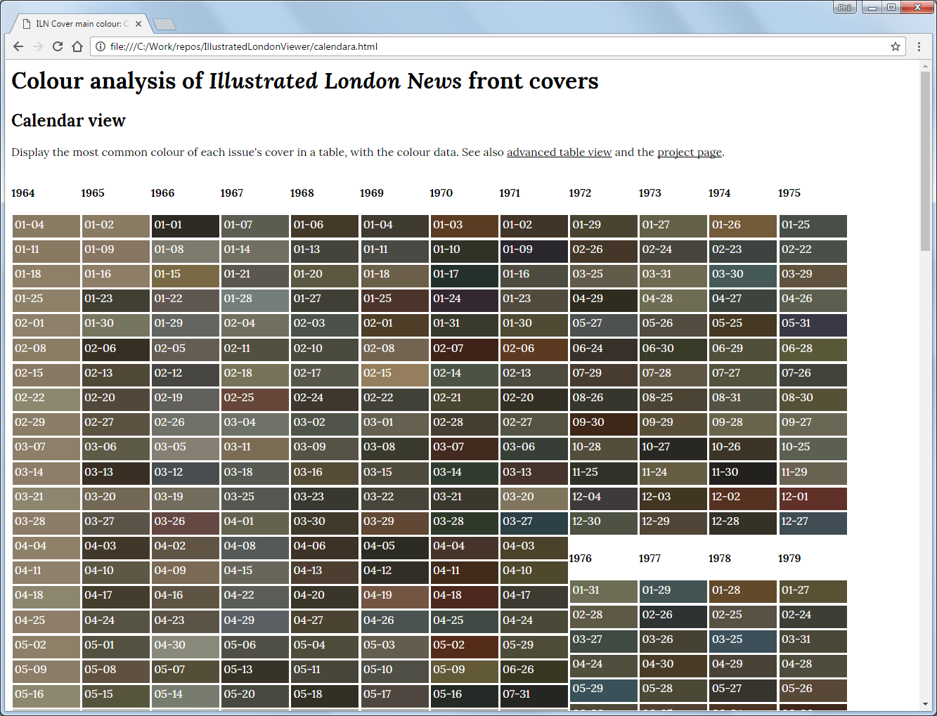 The tool has controls to alter the display, which may appear at the bottom or right of the screen. You can adjust scale, gridlines, wrapping and background colour (black or white). It might help to zoom in or out in the browser as well.
The image below shows the tool adjusted to fit all the issues on-screen, with a black background for clarity. Click the image to view full-size.
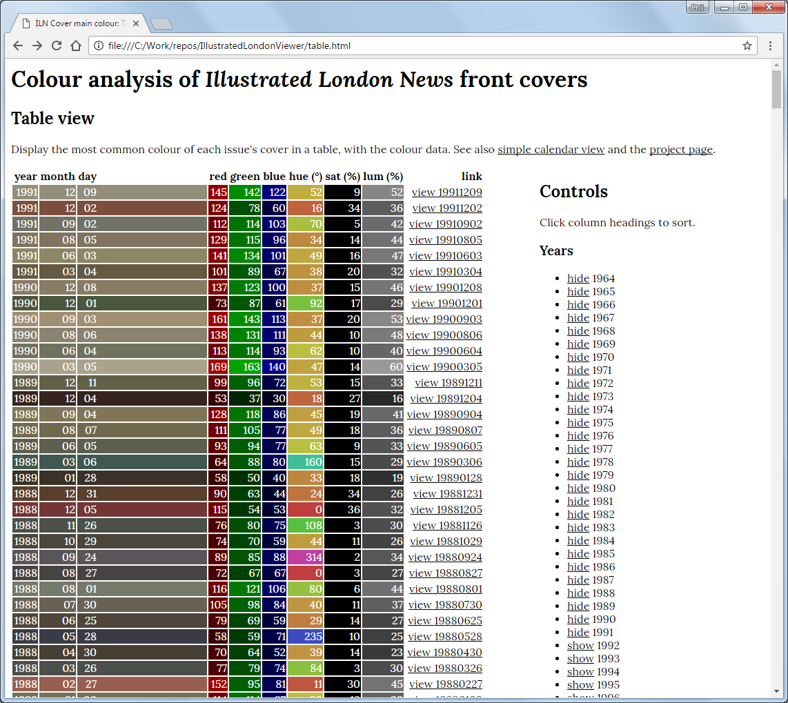
An alternative, advanced table view is also available, with each issue is accompanied by its red, green and blue values, plus the equivalent hue, luminance and saturation values. There are controls to alter the display of the table, and links to open the issue in the regular Gale Cengage web interface (if you are on-campus). Be aware, the average colour calculation is very crude, so anything you interpret from the hue, luminance and saturation numbers should be used with care.
Tasks
- Look at the average colours for each issue, what can you see?
- Are there trends? Does this give you a better idea of the change of publishing frequency with time?
- Is there a correlation between particular colours and particular dates, such as red during times of economic recession, black during times of war…? (Hint: one colour and season combination stands out to me.)
- Discuss what other features would make this sort of tool more useful for you, and what technical skills or resource might be necessary.
More tasks follow after the next part.
How was the tool built?
There were two stages to the process, both involving writing a little Python (version 2.7.6).
- Read all the front page image scans from bulk access hard drive, one JPG file per issue, and determine the most frequently occurring (mode) colour value for each (as a value for red, green and blue). Save this data to a CSV file.
- Read the CSV file with headings [year, month, day, red, green, blue] and produce an HTML page to show it. The is a script for calendar view, one for table view, and an example CSV file. Note that the RGB values are integers between 0 and 255.
 make_csv.py,
 create_calendara_page.py,
 create_table_page.py,
 dummy-values.csv
This version of Python is available on your University desktop through the Software Centre (search “Anaconda”).
A more developed example from Yale University Library, using Vogue
An established Digital Humanities Lab at Yale University Library has developed a series of projects titled Robots Reading Vogue.
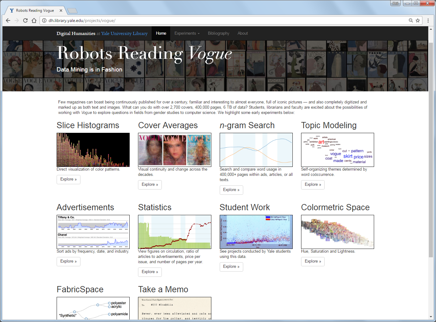
These projects cover text mining and image mining of the digitised ProQuest collection of the Vogue Archive, the entire run of Vogue magazine (US Edition), from the first edition in 1892 to the current month, reproduced in high resolution colour page images. We (currently) have standard web access to the collection; the projects that form Robots Reading Vogue depend on bulk access to the full text and images.
At the start of this Lab we looked at topic modelling and N-gram viewers, concerned with text mining the collection. Here, we turn to visualisation using the cover images, in particular, colourmetric space.
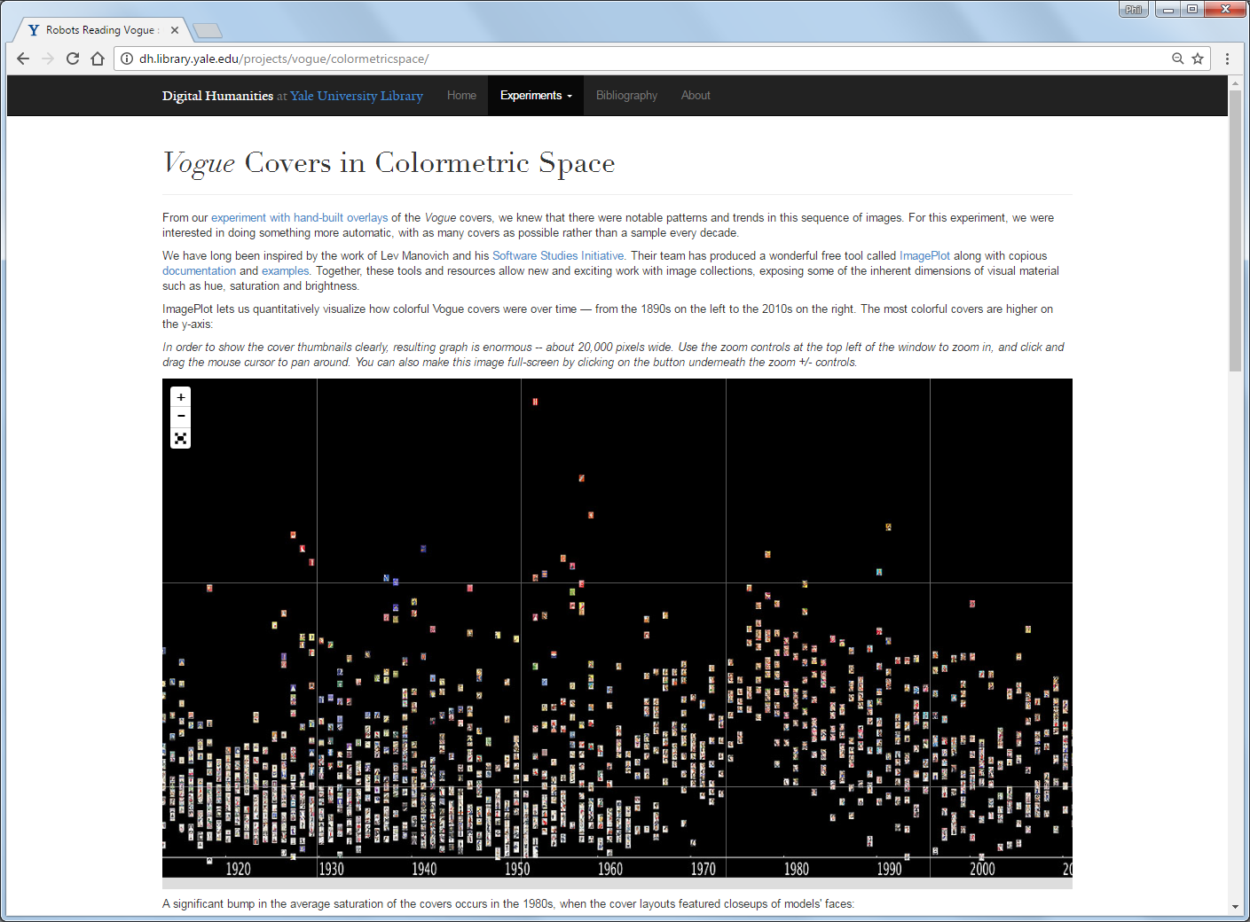
The project Vogue Covers in Colormetric Space uses the wonderful free tool ImagePlot to quantitatively visualise and display the covers of all issues of Vogue in an interactive chart. We can see how colourful Vogue covers were over time – from the 1890s on the left to the 2010s on the right. The most colourful covers are higher on the y-axis.
More tasks
- Open Vogue Covers in Colormetric Space. Can you see any trend in colour saturation? (Hint: an answer is given below the visualisation.)
- Look at some of the other Robots Reading Vogue image projects including slice histograms and the unadvertised colours ordered by frequency.
- What sort of research questions could you ask if could visualise an entire collection on one screen? Of course, that depends on the collection, so which collections might be of interest to explore like this?
